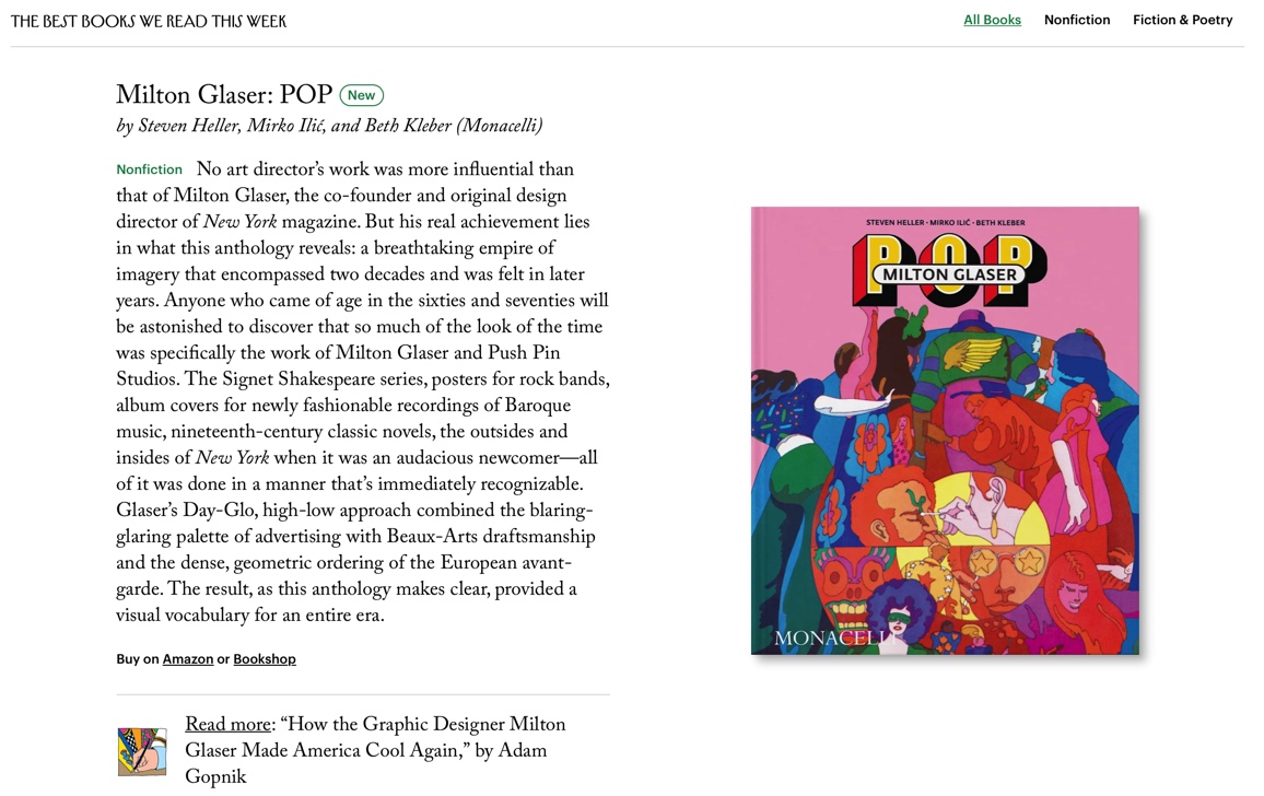
'No art director’s work was more influential than that of Milton Glaser, the co-founder and original design director of New York magazine. But his real achievement lies in what this anthology reveals: a breathtaking empire of imagery that encompassed two decades and was felt in later years.' – New Yorker

Thursday, March 30, 2023

Wednesday, March 22, 2023
WNYC, New York Public Radio: All Of It
'New York City officials this week unveiled the new “We  NYC” campaign, complete with a new logo that has received mixed reviews. The slogan riffs on the classic "I NY" image created in 1977 by influential graphic designer Milton Glaser, whose career is the subject of a new book out next week. Milton Glaser: POP explores the designer's work through the 1960s and 1970s, from posters to playbills and album art. Authors Steven Heller, Beth Kleber, and Mirko Ilić join us to discuss and take calls from listeners.'

"Milton Glaser: POP" in The New Yorker
A quote from the article, "How the Graphic Designer Milton Glaser Made America Cool Again" by Adam Gopnik in today’s The New Yorker.
'No art director’s work was more influential or instantly identifiable than that of Milton Glaser. The extent of that style, which adorned books and records and movies—and is revealed in a new anthology from Monacelli, courtesy of Steven Heller, Mirko Ilić, and Beth Kleber, titled simply “Milton Glaser: Pop”—is astounding. Glaser was famous as the co-founder and original design director of New York and as a creator of two images that helped define two decades. One was the 1966 poster of Bob Dylan that showed him with snakelike hair blossoming into a skein of rainbows. The other was the 1976 “INY” logo—which was commissioned by the State of New York but promptly adopted as a local symbol of the city, and, being keyed to the city’s unexpected revival, is the closest thing there has ever been to a logo that changed social history.'
'Of all the riches embedded in the Monacelli book, it may be the complete covers of the Signet Shakespeare, from around the same period as the Dylan poster, that are the most arresting. A central figure, usually enigmatically representative of the play’s action, appears in half-finished form, done in a charmingly elegant, linear style that recalls both Aubrey Beardsley and white-figure Greek vases; only a small patch of the drawing is in color, while the rest spins out like suggestive smoke. “Hamlet” is an agonized youth’s face, with a watching father’s head springing from his own and a barely suggested woman’s head—Ophelia?—alongside; “Julius Caesar,” memorably, is a tilting classical figure in profile, a zigzag of blue on a white implied toga to suggest greatness and a spot of pure red nearby to imply his stabbing. If you had no idea of what a play was about, none of these covers would tell you. Glaser relies on a general knowledge of the text—Hamlet is haunted, Julius Caesar is killed—and then suggests with his cryptic images that this story is more interesting and somehow more contemporary than one might have thought. The covers were less illustrations of the plays than they were invitations to read them.'

Monday, March 6, 2023
My Posters Featured on GraphisBlog
Today, the prestigious Graphis published on their GraphisBlog an article about my poster designs for the plays "Oedipus" and "Titus Andronicus" in production with JDP-Yugoslav Drama Theatre in Belgrade, Serbia.
You can read the article here.
The article also featured some of my other theater posters, including my recent posters for Lincoln Center Theater plays, "The Coast Starlight" and "The Skin of Our Teeth". I designed these two posters in collaboration with Nicky Lindeman from the advertising agency SpotCo.
You can see more of my poster designs here.


Friday, March 3, 2023
One Thing Leads to Another
Recently, when browsing on Boo-Hooray, an online underground movement archive, to my surprise, I noticed that they featured my art created in 1979 in their "Record Dreams" catalogue.

I created that art on my kitchen table as the LP cover for the then-unknown Croatian punk band Dirty Theater (Prljavo kazaliste). I came up with the idea for this cover partly because the band was very young and didn't know exactly how to play. They wanted to sound like The Rolling Stones, but they sounded punk because of their lack of skills. Also, referencing The Rolling Stone's song "Some Girls", Dirty Theater had a song named "Some Boys". Because of all these elements, I created this image. The record became an instant hit in Yugoslavia.
After that, I did many other things. I moved to the US and almost forgot about that project.
Suddenly, in 2012, the Hayward Gallery in London created "Someday All the Adults Will Die": Punk Graphics 1971—1984 show. Among others, they exhibited my cover.


Then, the cherry on the cake, in 2023, MoMA (Museum of Modern Art in New York) included that cover in their collection.
Not bad for a 2-day work on a kitchen table.
Subscribe to:
Posts (Atom)