Logograma: Logo Design for Dynamic Identities by Sandu Publishing included our logo for Play Restaurant at the Broadmoor Hotel.
The Play logo is included in the book because it consists of multiple variations of logos which can be adjusted and applied for different uses.
Publisher's statement
about the book's concept:
"Varying a logo makes a brand identity richer and more expressive, though regardless of how the original logo is developed, its dynamic forms must still convey the core values of the brand. Logograma reveals the infinite imaginative possibilities within any given brand by providing an insight into how new logos are generated through changes in colour, form, typography, images and other elements in order to leave a lasting visual impression on the people who see them."
Wednesday, December 10, 2014
Wednesday, November 26, 2014
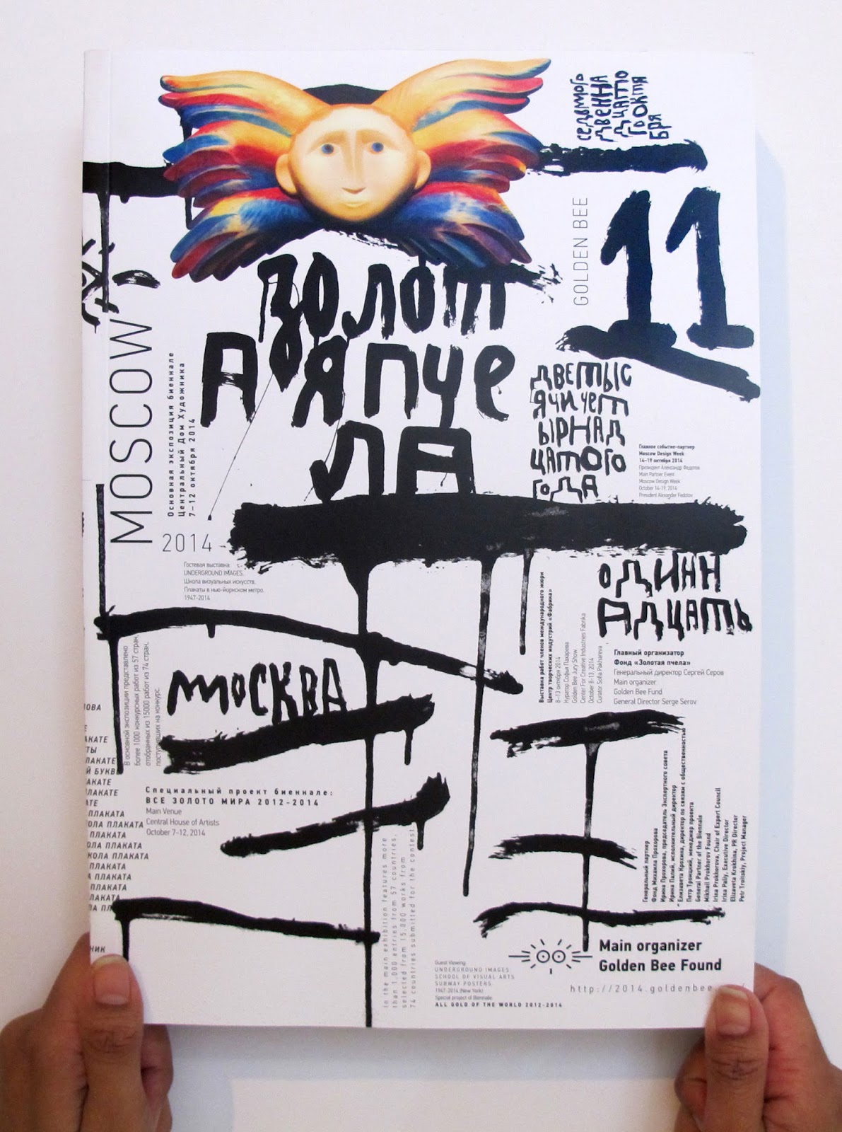
Golden Bee Global Biennale of Graphic Design Catalogue
The Golden Bee Global Biennale of Graphic Design is one of the most prestigious shows in the world. I was honored to be one of the judges this year.
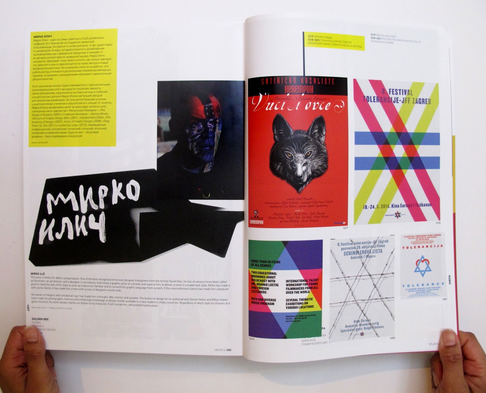
Golden Bee selected and created a show for each of the judges. Each of us were given 4 pages in the catalogue to showcase our work, beautifully designed by Peter Bankov.
The catalogue includes over 15,000 works from 74 countries.
It is worth seeing.
The catalogue includes over 15,000 works from 74 countries.
It is worth seeing.
Tuesday, November 18, 2014
Illustrations from the 1970's, "Start" Magazine
Seems like someone recently re-discovered my illustrations for Start magazine from the 1970's. And now they are suddenly popping up on different blogs. For me, it's nice to see because some of them I totally forgot I ever did.
Tuesday, November 11, 2014
From SPD's blog:
POW! Which Artwork Landed the Strongest Punch Ever?
by SPD Guest Editor, Steve Brodner

Brad Holland, "The Junkie," 1971, The New York Times, Op-Ed page I discovered this drawing in Graphis Annual (1972). It had such a powerful influence on me, that I decided to pay more attention to my editorial illustration. I was lucky in 1992, to become art director of the same Op-Ed Pages of The New York Times, where I was able to hire Brad Holland to do illustrations for me.
My design and illustration for the movie poster "Red and Black"
by SPD Guest Editor, Steve Brodner
"We asked some of America's most powerful artists which pieces got THEIR blood up the most.
In our choice of going light or strong with graphic commentary in media, quite often the pull is toward stepping lightly and letting the text carry the heavy artillery. Editors and advertisers often prefer the punch to be hidden in the text, leaving the page design, for the sake of keeping the mercantile party polite, to just hint at the force of the subject matter.
The artists below (Edel Rodriguez, Brian Stauffer, Frances Jetter, Mirko Ilic and Peter Kuper) remind us that there are times when the jugular is the preferred target. The gravity of a story can be brilliantly reflected in art that pulls out all stops. I have asked these artists, who are masters of the art of blending graphic beauty with topical awareness and moral conviction to join me in picking a few pieces by THEIR favorite artists who have given them some of their greatest inspiration. And they also selected one of their own pieces."
Complete story here: http://www.spd.org/2014/11/your-3-pixi-asked-three.php

Brad Holland, "The Junkie," 1971, The New York Times, Op-Ed page I discovered this drawing in Graphis Annual (1972). It had such a powerful influence on me, that I decided to pay more attention to my editorial illustration. I was lucky in 1992, to become art director of the same Op-Ed Pages of The New York Times, where I was able to hire Brad Holland to do illustrations for me.
My design and illustration for the movie poster "Red and Black"
Directed by Miroslav Mikuljan, Jadran Film, 1985
Thursday, October 23, 2014
Golden Bee - 10 Picks
After returning from judging the 2014 Golden Bee Global Biennale in Moscow (along with Reza Abedini, Jonathan Barnbrook, Eric Belousov, Lech Majewski, and Guta Moura Guedes), as well as opening the show for the SVA NYC subway posters, Steve Heller asked me to choose 10 from the 1300 posters of the Golden Bee show, and to describe why I like them.
You can read more about it here: http://www.printmag.com/daily-heller/bite-of-the-golden-bee/
Below are a series of posters by Kum-Jun Park, which won the Grand Prix:
You can read more about it here: http://www.printmag.com/daily-heller/bite-of-the-golden-bee/
Below are a series of posters by Kum-Jun Park, which won the Grand Prix:
Tuesday, October 21, 2014
A History of Graphic Design by Guity Novin
Guity Novin, is a painter and graphic designer, who has founded the Transpressionism Movement (Ottawa, 1994). A movement in painting that demands from its viewers to participate in the creation of art through the conduit of their common human memories.
She is also writing A History of Graphic Design, and The History of Graphic Design in Iran. (Both of which are digitally available by chapter.) She has some unusual aspects and good examples from Iran. It's worth visiting the sites. In Chapter 58 of A History of Graphic Design, Novin also includes some samples of the Op-Ed pages during my time as art director at The New York Times.
http://guity-novin.blogspot.ca/2012/04/modern-newspaper-magazine-layouts.html
More of them can be seen here:
https://www.behance.net/gallery/20679521/New-York-Times-Op-Ed-Pages
Friday, October 17, 2014
Ristorante and Bar Del Lago
We designed the visual identity for the Italian restaurant and bar, Ristorante and Bar Del Lago
(del lagotranslates to at the lake), two entities under the same roof, at The Broadmoor Hotel.
Subscribe to:
Posts (Atom)